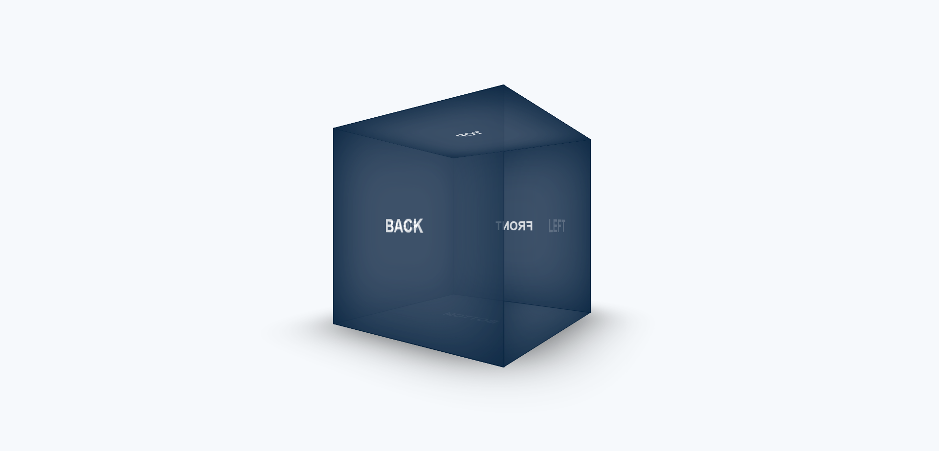
Discover the art of 3D design with our Rotated Cube tutorial using CSS3. Learn techniques to create stunning visual effects for your web projects
HTML Code
<div class="container">
<div class="cube">
<div class="cube__face cube-face--bottom shadow"></div>
<div class="cube__face cube-face--left">
<span class="text">left</span>
</div>
<div class="cube__face cube-face--front">
<span class="text">front</span>
</div>
<div class="cube__face cube-face--back">
<span class="text">back</span>
</div>
<div class="cube__face cube-face--right">
<span class="text">right</span>
</div>
<div class="cube__face cube-face--top">
<span class="text">top</span>
</div>
<div class="cube__face cube-face--bottom">
<span class="text">bottom</span>
</div>
</div>
</div>
CSS3 Code
* {
margin: 0;
padding: 0;
box-sizing: border-box;
}
body {
height: 100vh;
display: flex;
align-items: center;
justify-content: center;
background: #f6f9fc;
}
.text {
font-weight: bold;
font-family: Arial;
text-transform: uppercase;
}
.container {
perspective: 600px;
}
.cube {
position: relative;
width: 300px;
height: 300px;
transform-style: preserve-3d;
animation: spin 45s linear infinite;
}
.cube__face {
position: absolute;
width: 100%;
height: 100%;
display: flex;
align-items: center;
justify-content: center;
opacity: .75;
color: white;
font-size: 24px;
text-align: center;
background-color: #3e526a;
box-shadow: inset 0 0 100px #02203c;
outline: 1px solid #02203c;
}
.cube-face--left {
transform: rotateY(-90deg) translateZ(150px);
}
.cube-face--front {
transform: rotateY(0deg) translateZ(150px);
}
.cube-face--back {
transform: rotateY(180deg) translateZ(150px);
}
.cube-face--right {
transform: rotateY(90deg) translateZ(150px);
}
.cube-face--top {
transform: rotateX(90deg) translateZ(150px);
}
.cube-face--bottom {
transform: rotateX(-90deg) translateZ(150px);
}
.shadow {
outline: none;
background: rgba(0,0,0,0);
box-shadow: 0 0 100px #000;
}
@keyframes spin {
from {
transform: rotateY(0deg);
}
to {
transform: rotateY(360deg);
}
}