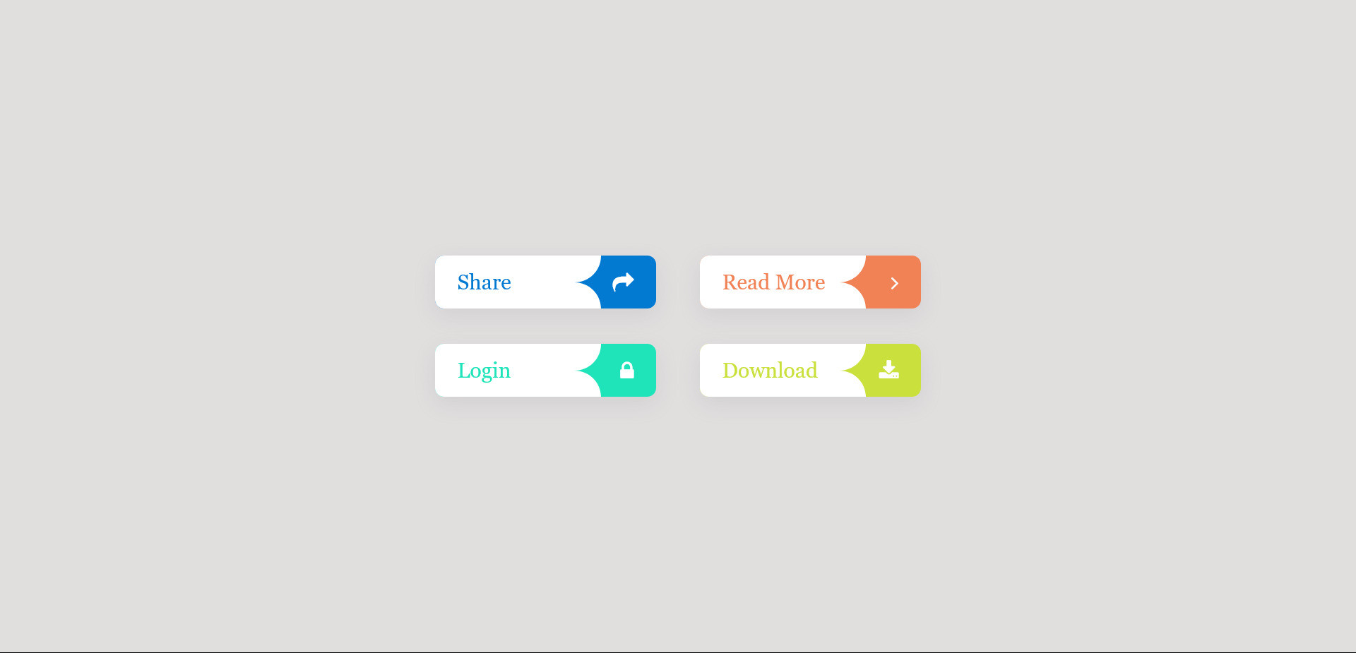
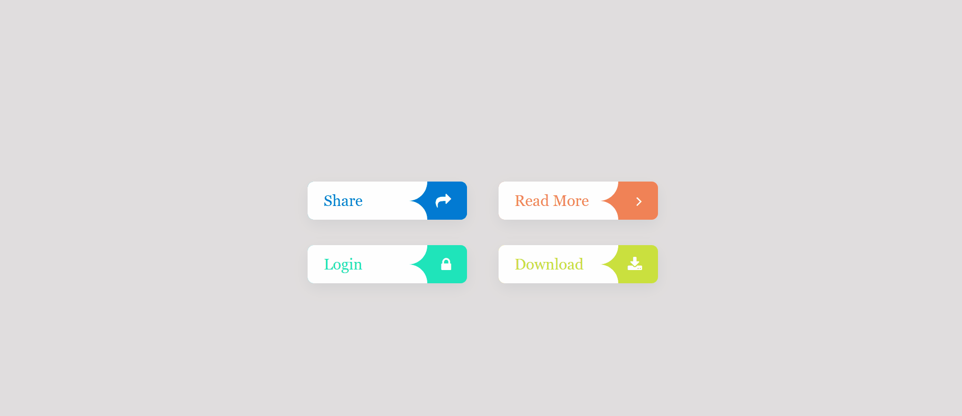
This snippet likely refers to a code example that demonstrates how to create buttons using CSS3 with animated icons.
These buttons are visually appealing and can enhance user interaction on your website
HTML Code
<head>
<link rel="stylesheet" href="https://cdnjs.cloudflare.com/ajax/libs/font-awesome/4.7.0/css/font-awesome.min.css">
</head>
<div class="btn-container">
<div class="btn" style="background-color: #027AD2;">
<a href="#" style="color: #027AD2;">Share</a>
<i class="fa fa-share"></i>
</div>
<div class="btn" style="background-color: #f08256;">
<a href="#" style="color: #f08256;">Read More</a>
<i class="fa fa-angle-right"></i>
</div>
<div class="btn" style="background-color: #1fe4ba;">
<a href="#" style="color: #1fe4ba;">Login</a>
<i class="fa fa-lock"></i>
</div>
<div class="btn" style="background-color: #cae03d;">
<a href="#" style="color: #cae03d;">Download</a>
<i class="fa fa-download"></i>
</div>
</div>
CSS Code
* {
margin: 0;
padding: 0;
box-sizing: border-box;
}
body {
background-color: rgb(225, 222, 222);
display: flex;
height: 100vh;
justify-content: center;
align-items: center;
}
.btn-container {
width: 600px;
display: flex;
flex-wrap: wrap;
justify-content: space-around;
}
.btn-container .btn {
position: relative;
display: flex;
align-items: center;
width: 250px;
height: 60px;
margin: 20px;
overflow: hidden;
cursor: pointer;
border-radius: 10px;
box-shadow: rgba(149, 157, 165, 0.2) 0px 8px 24px;
}
.btn-container .btn::before {
content: '';
position: absolute;
top: 0;
left: 0;
width: 75%;
height: 50%;
background-color: white;
border-bottom-right-radius: 40px;
transition: 0.5s;
}
.btn-container .btn::after {
content: '';
position: absolute;
bottom: 0;
left: 0;
width: 75%;
height: 50%;
background-color: white;
border-top-right-radius: 40px;
transition: 0.5s;
}
.btn-container .btn:hover::before,.btn-container .btn:hover::after {
width: 120%;
}
.btn-container .btn a {
position: absolute;
left: 25px;
font-family: Georgia, 'Times New Roman', Times, serif;
font-size: 1.5em;
text-decoration: none;
z-index: 1;
transition: 0.5s;
}
.btn-container .btn:hover a{
transform: translateX(25px);
}
.btn-container .btn i {
position: absolute;
right: 25px;
font-size: 1.5em;
color: white;
z-index: 1;
}
.btn-container .btn:hover i{
opacity: 0;
}