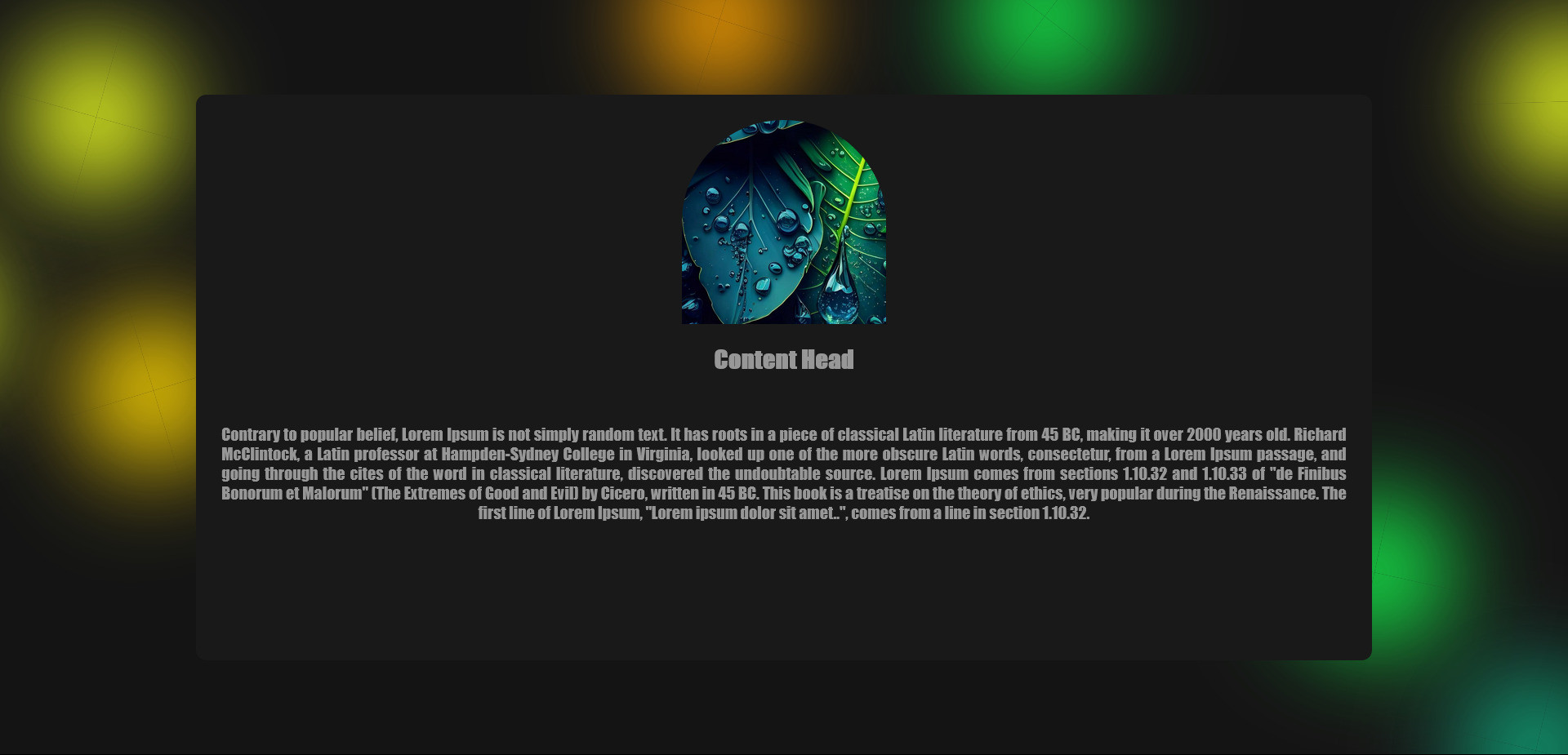
This snippet utilizes CSS3 to create a visually appealing and dynamic animated background filled with floating bubbles.
It achieves this animation without the need for JavaScript, relying solely on CSS properties and keyframes.


HTML Code
<div class="content">
<img src="https://i.pinimg.com/736x/ab/6b/42/ab6b4291ab49fce9fabb9891755b7693.jpg" alt="">
<h2>Content Head</h2>
<p>Contrary to popular belief, Lorem Ipsum is not simply random text. It has roots in a piece of classical Latin literature from 45 BC, making it over 2000 years old. Richard McClintock, a Latin professor at Hampden-Sydney College in Virginia, looked up one of the more obscure Latin words, consectetur, from a Lorem Ipsum passage, and going through the cites of the word in classical literature, discovered the undoubtable source. Lorem Ipsum comes from sections 1.10.32 and 1.10.33 of "de Finibus Bonorum et Malorum" (The Extremes of Good and Evil) by Cicero, written in 45 BC. This book is a treatise on the theory of ethics, very popular during the Renaissance. The first line of Lorem Ipsum, "Lorem ipsum dolor sit amet..", comes from a line in section 1.10.32.</p>
</div>
<div class="blur-background">
<span></span>
<span></span>
<span></span>
<span></span>
<span></span>
<span></span>
<span></span>
<span></span>
<span></span>
<span></span>
</div>
CSS Code
* {
padding: 0;
margin: 0;
box-sizing: border-box;
}
body {
background-color: #1B1B1B;
display: flex;
justify-content: center;
align-items: center;
height: 100vh;
}
.content {
position: relative;
width: 75%;
min-height: 75vh;
background-color: #191919;
text-align: center;
color: #979797;
padding: 25px;
border-radius: 10px;
font-family: Impact, Haettenschweiler, 'Arial Narrow Bold', sans-serif;
}
.content img {
width: 200px;
height: 200px;
object-fit: cover;
border-top-left-radius: 100px;
border-top-right-radius: 100px;
margin-bottom: 20px;
}
.content p {
position: relative;
margin-top: 50px;
text-align: justify;
text-align-last: center;
}
.blur-background {
position: fixed;
overflow: hidden;
top: 0;
left: 0;
width: 100%;
height: 100%;
background: #141414;
z-index: -1;
}
.blur-background span {
width: 20vmin;
height: 20vmin;
border-radius: 20vmin;
backface-visibility: hidden;
position: absolute;
animation-name: blured_move;
animation-duration: 6s;
animation-timing-function: linear;
animation-iteration-count: infinite;
}
.blur-background span:nth-child(1) {
color: #edff20;
top: 56%;
left: 9%;
animation-duration: 11s;
animation-delay: -8.1s;
transform-origin: 6vw -10vh;
box-shadow: 40vmin 0 13.0166555866vmin ;
}
.blur-background span:nth-child(2) {
color: #0fa377;
top: 72%;
left: 75%;
animation-duration: 11.1s;
animation-delay: -3.8s;
transform-origin: -12vw 9vh;
box-shadow: 40vmin 0 13.0166555866vmin ;
}
.blur-background span:nth-child(3) {
color: #edff20;
top: 9%;
left: 81%;
animation-duration: 11.9s;
animation-delay: -7.1s;
transform-origin: 23vw 2vh;
box-shadow: 40vmin 0 13.0166555866vmin ;
}
.blur-background span:nth-child(4) {
color: gold;
top: 2%;
left: 17%;
animation-duration: 12s;
animation-delay: -2.8s;
transform-origin: -16vw 8vh;
box-shadow: 40vmin 0 13.0166555866vmin ;
}
.blur-background span:nth-child(5) {
color: #0fa377;
top: 25%;
left: 4%;
animation-duration: 15.6s;
animation-delay: -8s;
transform-origin: -20vw -22vh;
box-shadow: 40vmin 0 13.0166555866vmin ;
}
.blur-background span:nth-child(6) {
color: gold;
top: 25%;
left: 11%;
animation-duration: 12.4s;
animation-delay: -7.2s;
transform-origin: 6vw -17vh;
box-shadow: 40vmin 0 13.0166555866vmin ;
}
.blur-background span:nth-child(7) {
color: orange;
top: 5%;
left: 29%;
animation-duration: 10.4s;
animation-delay: -8.4s;
transform-origin: 20vw 5vh;
box-shadow: 40vmin 0 13.0166555866vmin ;
}
.blur-background span:nth-child(8) {
color: #edff20;
top: 38%;
left: 18%;
animation-duration: 14s;
animation-delay: -13.9s;
transform-origin: 5vw -1vh;
box-shadow: 40vmin 0 13.0166555866vmin ;
}
.blur-background span:nth-child(9) {
color: #14ee4a;
top: 63%;
left: 83%;
animation-duration: 11.6s;
animation-delay: -10.9s;
transform-origin: -2vw -11vh;
box-shadow: 40vmin 0 13.0166555866vmin ;
}
.blur-background span:nth-child(10) {
color: #14ee4a;
top: 44%;
left: 64%;
animation-duration: 12s;
animation-delay: -4.7s;
transform-origin: -24vw 17vh;
box-shadow: 40vmin 0 13.0166555866vmin ;
}
@keyframes blured_move {
100% {
transform: translate3d(0,0,1px) rotate(360deg);
}
}