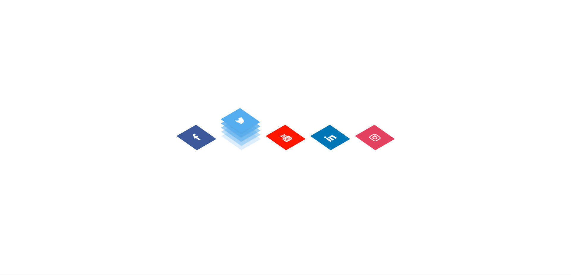
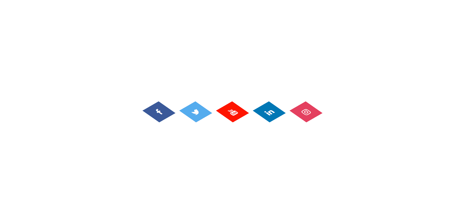
A piece of code that uses CSS3 properties to create buttons that have a unique "floppy" effect when hovered over.
This effect typically involves the button scaling down slightly and rotating a bit, giving it a sense of depth and bounce.
Here are some key features of CSS3 Fluppy Buttons:
Hover Effect: The main characteristic is the animation that occurs when the user hovers their cursor over the button. This animation often involves a combination of scaling and rotation, making the button appear to "flop" or "bounce" subtly.
CSS3 Properties: The effect is achieved using CSS3 properties like transform, transition, and animation. These properties allow for smooth and dynamic changes in the button's appearance on hover.
Customization: Fluppy buttons can be customized in various ways, including adjusting the amount of scaling, rotation, and animation speed. You can also change the button's color, shape, and other visual styles to match your website's design.
Overall, CSS3 Fluppy Buttons offer a visually appealing and interactive way to enhance your website's buttons, adding a touch of personality and fun to the user experience.
HTML Code
<head>
<link rel="stylesheet" href="https://cdnjs.cloudflare.com/ajax/libs/font-awesome/4.7.0/css/font-awesome.min.css">
</head>
<div class="icons-container">
<ul>
<li>
<a href="#">
<span></span>
<span></span>
<span></span>
<span></span>
<span class="fa fa-facebook"></span>
</a>
</li>
<li>
<a href="#">
<span></span>
<span></span>
<span></span>
<span></span>
<span class="fa fa-twitter"></span>
</a>
</li>
<li>
<a href="#">
<span></span>
<span></span>
<span></span>
<span></span>
<span class="fa fa-youtube"></span>
</a>
</li>
<li>
<a href="#">
<span></span>
<span></span>
<span></span>
<span></span>
<span class="fa fa-linkedin "></span>
</a>
</li>
<li>
<a href="#">
<span></span>
<span></span>
<span></span>
<span></span>
<span class="fa fa-instagram"></span>
</a>
</li>
</ul>
</div>
CSS Code
* {
margin: 0;
padding: 0;
box-sizing: border-box;
}
.icons-container {
display: flex;
justify-content: center;
align-items: center;
height: 100vh;
}
.icons-container ul {
position: relative;
margin: 0;
padding: 0;
display: flex;
justify-content: center;
flex-wrap: wrap;
}
.icons-container ul li {
position: relative;
list-style: none;
width: 60px;
height: 60px;
margin: 0 30px;
transform: rotate(-30deg) skew(25deg);
}
.icons-container ul li span {
position: absolute;
top: 0;
left: 0;
width: 100%;
height: 100%;
transition: 0.5s;
display: flex;
justify-content: center;
align-items: center;
color: white;
font-size: 1.5em;
}
.icons-container ul li:hover span:nth-child(5){
transform: translate(40px, -40px);
opacity: 1;
}
.icons-container ul li:hover span:nth-child(4){
transform: translate(30px, -30px);
opacity: 0.8;
}
.icons-container ul li:hover span:nth-child(3){
transform: translate(20px, -20px);
opacity: 0.6;
}
.icons-container ul li:hover span:nth-child(2){
transform: translate(10px, -10px);
opacity: 0.4;
}
.icons-container ul li:hover span:nth-child(1){
transform: translate(0px, 0px);
opacity: 0.2;
}
.icons-container ul li:hover span {
box-shadow: -1px 1px 1px rgba(0, 0, 0, 0.1);
}
.icons-container ul li:nth-child(1) span {
background-color: #3b5999;
}
.icons-container ul li:nth-child(2) span {
background-color: #55acee;
}
.icons-container ul li:nth-child(3) span {
background-color: #ff1500;
}
.icons-container ul li:nth-child(4) span {
background-color: #0077b5;
}
.icons-container ul li:nth-child(5) span {
background-color: #e4405f;
}