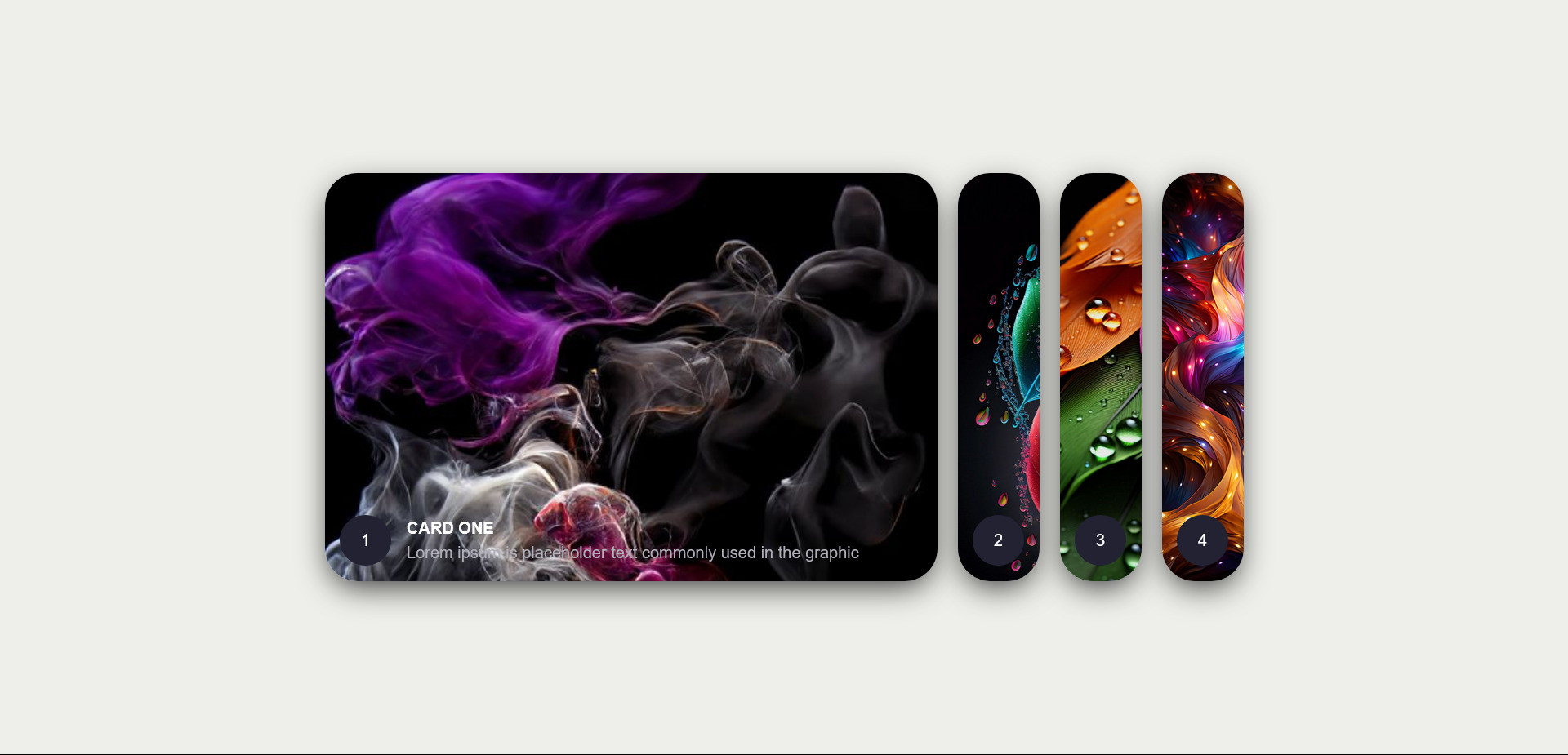
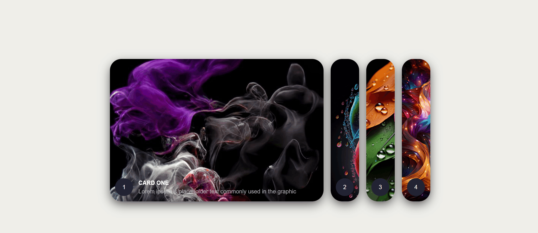
This snippet utilizes the power of CSS3 to create a visually appealing and interactive sliding effect for cards on your website.
Here's a breakdown of its key features:
HTML Structure:
The code uses basic HTML elements like <div> to structure the cards.
Each card can contain content like images, text, and buttons.
CSS Styles:
CSS3 properties like transition and transform are used to animate the sliding effect.
The snippet likely defines different states for the cards, such as a default state and a "hover" state where the card slides in response to user interaction (e.g., hovering over it with the mouse).
Additional styles might be included to customize the appearance of the cards, including background colors, borders, and shadows.
- Functionality:
When the user interacts with the card (e.g., hovering over it), the CSS transitions smoothly animate the card's position, creating a visually engaging sliding effect.
The snippet can be easily adapted to different card designs and layouts.
HTML Code
<div class="wrapper">
<div class="container">
<input type="radio" name="slide" id="c1" checked>
<label for="c1" class="card">
<div class="row">
<div class="icon">1</div>
<div class="description">
<h4>Card One</h4>
<p>Lorem ipsum is placeholder text commonly used in the graphic</p>
</div>
</div>
</label>
<input type="radio" name="slide" id="c2" >
<label for="c2" class="card">
<div class="row">
<div class="icon">2</div>
<div class="description">
<h4>Card Two</h4>
<p>Lorem ipsum is placeholder text commonly used in the graphic</p>
</div>
</div>
</label>
<input type="radio" name="slide" id="c3" >
<label for="c3" class="card">
<div class="row">
<div class="icon">3</div>
<div class="description">
<h4>Card Three</h4>
<p>Lorem ipsum is placeholder text commonly used in the graphic</p>
</div>
</div>
</label>
<input type="radio" name="slide" id="c4" >
<label for="c4" class="card">
<div class="row">
<div class="icon">4</div>
<div class="description">
<h4>Card Four</h4>
<p>Lorem ipsum is placeholder text commonly used in the graphic</p>
</div>
</div>
</label>
</div>
</div>
CSS Code
* {
box-sizing: border-box;
margin: 0;
padding: 0;
font-family: Arial, Helvetica, sans-serif;
}
body {
background-color: #eeeeea;
}
.wrapper {
width: 100%;
height: 100vh;
display: flex;
align-items: center;
justify-content: center;
}
.container {
height: 400px;
display: flex;
flex-wrap: nowrap;
justify-content: start;
}
.card {
width: 80px;
border-radius: .75rem;
background-size: cover;
cursor: pointer;
overflow: hidden;
border-radius: 2rem;
margin: 0 10px;
display: flex;
align-items: flex-end;
transition: .6s cubic-bezier(.28,-0.03,0,.99);
box-shadow: 0px 10px 30px -5px rgba(0,0,0,0.8);
}
.card > .row {
color: white;
display: flex;
flex-wrap: nowrap;
}
.card > .row > .icon {
background: #223;
color: white;
border-radius: 50%;
width: 50px;
min-width: 50px;
display: flex;
justify-content: center;
align-items: center;
margin: 15px;
}
.card > .row > .description {
display: flex;
justify-content: center;
flex-direction: column;
overflow: hidden;
height: 80px;
opacity: 0;
transform: translateY(30px);
transition-delay: .3s;
transition: all .3s ease;
}
.description p {
color: #b0b0ba;
padding-top: 5px;
}
.description h4 {
text-transform: uppercase;
}
input {
display: none;
}
input:checked + label {
width: 600px;
}
input:checked + label .description {
opacity: 1 !important;
transform: translateY(0) !important;
}
.card[for="c1"] {
background-image: url('https://i.pinimg.com/564x/b7/1c/f9/b71cf9889fe0dec391d44af3f5e94a80.jpg');
}
.card[for="c2"] {
background-image: url('https://i.pinimg.com/736x/e0/43/fb/e043fbb738588c2bf5ec940ba7481736.jpg');
}
.card[for="c3"] {
background-image: url('https://i.pinimg.com/736x/53/d6/e4/53d6e431b11f243773256c97958a82c6.jpg');
}
.card[for="c4"] {
background-image: url('https://i.pinimg.com/736x/5a/fa/37/5afa37058d4ac2921eacc19c5e9e9293.jpg');
}
@media screen and (max-width:500px) {
input:checked + label {
width: 300px;
}
.card {
width: 20px;
}
}