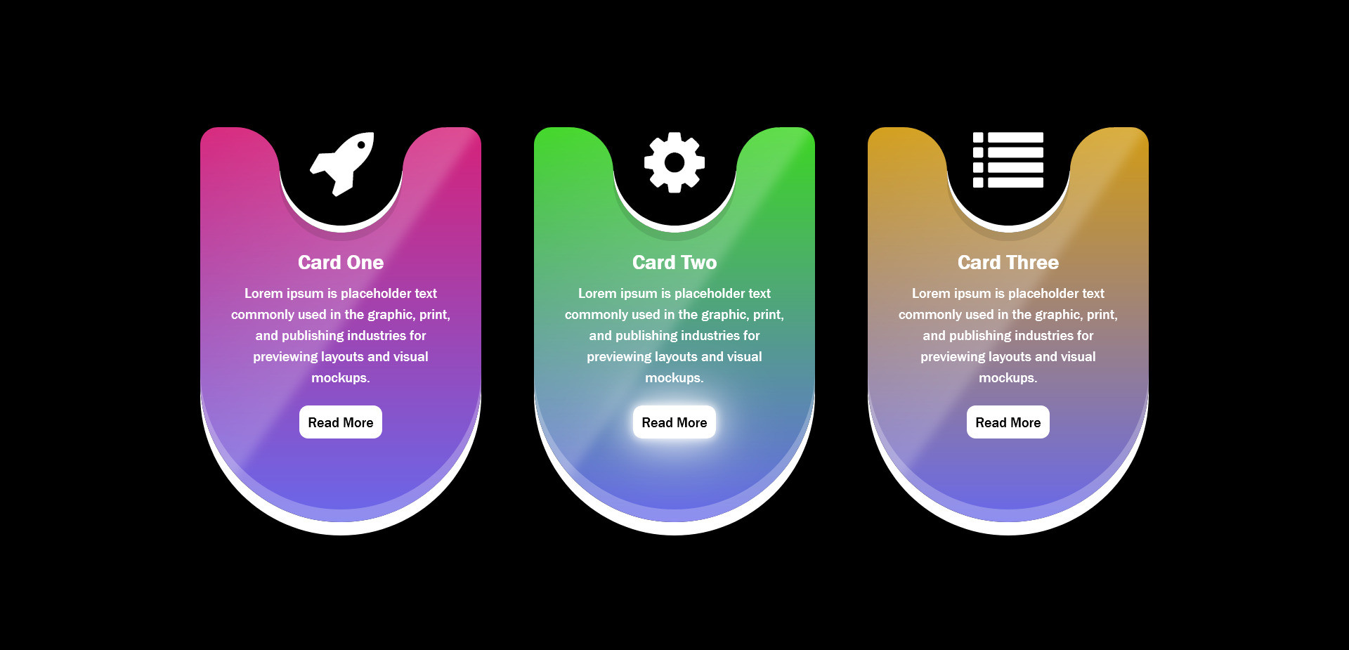
A piece of code that uses CSS3 properties to create visually appealing and unique card shapes for your web projects.
These snippets go beyond the basic rectangular card design, allowing you to explore various shapes
HTML Code
<head>
<link rel="stylesheet" href="https://cdnjs.cloudflare.com/ajax/libs/font-awesome/4.7.0/css/font-awesome.min.css">
</head>
<div class="cards-container">
<div class="card">
<div class="icon"><i class="fa fa-rocket"></i></div>
<div class="content">
<h2>Card One</h2>
<p>Lorem ipsum is placeholder text commonly used in the graphic, print, and publishing industries for previewing layouts and visual mockups.</p>
<a href="#">Read More</a>
</div>
</div>
<div class="card">
<div class="icon"><i class="fa fa-gear"></i></div>
<div class="content">
<h2>Card Two</h2>
<p>Lorem ipsum is placeholder text commonly used in the graphic, print, and publishing industries for previewing layouts and visual mockups.</p>
<a href="#">Read More</a>
</div>
</div>
<div class="card">
<div class="icon"><i class="fa fa-list"></i></div>
<div class="content">
<h2>Card Three</h2>
<p>Lorem ipsum is placeholder text commonly used in the graphic, print, and publishing industries for previewing layouts and visual mockups.</p>
<a href="#">Read More</a>
</div>
</div>
</div>
CSS Code
* {
padding: 0;
margin: 0;
box-sizing: border-box;
}
body {
background-color: black;
}
.cards-container {
display: flex;
justify-content: center;
align-items: center;
height: 100vh;
flex-wrap: wrap;
padding: 40px;
}
.card {
position: relative;
width: 320px;
height: 450px;
margin: 30px;
background-color: blueviolet;
border-radius: 20px;
border-bottom-left-radius: 160px;
border-bottom-right-radius: 160px;
box-shadow: 0 15px 0 white,
inset 0 -15px 0 rgba(255,255,255,0.25),
0 45px 0 rgba(0, 0, 0, 0.15);
overflow: hidden;
display: flex;
justify-content: center;
align-items: flex-start;
}
.card::before {
content: '';
position: absolute;
top: -140px;
left: -40%;
width: 100%;
height: 120%;
background: linear-gradient(90deg, transparent, rgba(255,255,255,0.2));
transform: rotate(35deg);
pointer-events: none;
filter: blur(5px);
}
.card:nth-child(1){
background: linear-gradient(to bottom, rgb(214, 33, 121), rgb(104, 104, 235));
}
.card:nth-child(2){
background: linear-gradient(to bottom, rgb(60, 214, 33), rgb(104, 104, 235));
}
.card:nth-child(3){
background: linear-gradient(to bottom, rgb(210, 156, 19), rgb(104, 104, 235));
}
.card .icon {
position: relative;
width: 140px;
height: 120px;
background-color: black;
border-bottom-left-radius: 100px;
border-bottom-right-radius: 100px;
box-shadow: 0 10px 0 rgba(0, 0, 0, 0.1 ),
inset 0 -8px 0 white;
z-index: 10 ;
display: flex;
justify-content: center;
}
.card .icon::before {
content: '';
position: absolute;
top: 0;
left: -50px;
width: 50px;
height: 50px;
background: transparent;
border-top-right-radius: 50px;
box-shadow: 15px -15px 0 15px black;
}
.card .icon::after {
content: '';
position: absolute;
top: 0;
right: -50px;
width: 50px;
height: 50px;
background: transparent;
border-top-left-radius: 50px;
box-shadow: -15px -15px 0 15px black;
}
.card .icon i {
color: white;
position: relative;
font-size: 5em;
}
.card .content {
position: absolute;
width: 100%;
padding: 30px;
padding-top: 140px;
text-align: center;
font-family: 'Franklin Gothic Medium', 'Arial Narrow', Arial, sans-serif;
}
.card .content h2 {
color: white;
margin-bottom: 10px;
}
.card .content p {
color: white;
line-height: 1.5em;
margin-bottom: 30px;
}
.card .content a {
text-decoration: none;
background-color: white;
color: black;
padding: 10px;
border-radius: 10px;
}
.card .content a:hover {
box-shadow: 0 0 10px white, 0 0 40px white, 0 0 80px white;
}