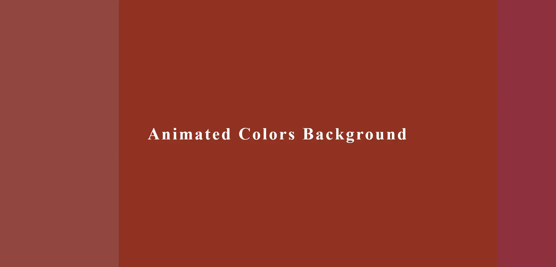
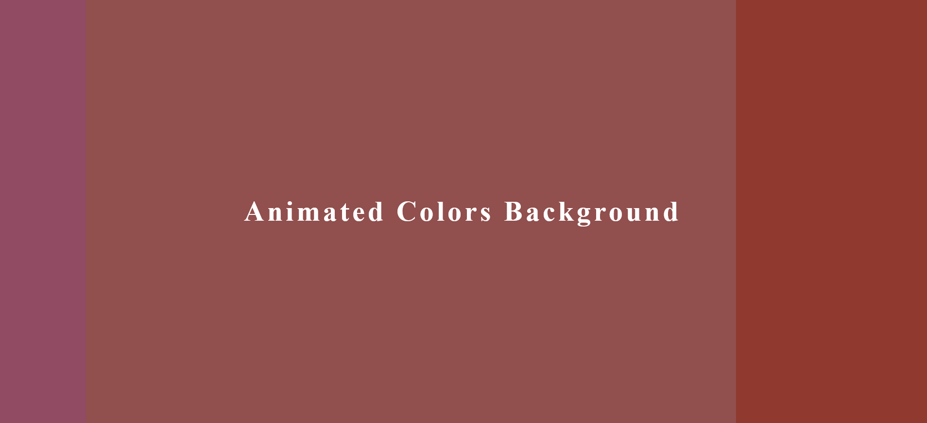
A piece of code that creates a dynamic and visually interesting background for your web page.
It uses CSS3 properties, specifically animations and gradients, to produce a background that changes color over time
HTML Code
<div class="layer layer1"></div>
<div class="layer layer2"></div>
<div class="layer layer3"></div>
<div class="header-text">
<h2>Animated Colors Background</h2>
</div>
CSS Code
body{
margin: 0;
padding: 0;
background-color: blueviolet;
}
.header-text{
position: fixed;
left: 50%;
top: 50%;
transform: translate(-50%,-50%);
}
.header-text h2 {
color: white;
font-size: 3vw;
letter-spacing: 5px;
}
.layer{
position: fixed;
top: 0;
bottom: 0;
right: -50%;
left: -50%;
background: linear-gradient(90deg, #935639 50%, #903207 50%);
opacity: 0.5;
z-index: -1;
animation: animate 5s ease-in-out infinite alternate;
}
.layer2{
animation-direction: alternate-reverse;
animation-duration: 3s;
}
.layer3{
animation-duration: 5s;
}
@keyframes animate {
0%{
transform: translateX(-50%);
}
100%{
transform: translateX(50%);
}
}